By Empower Branding | Notes from the studio
A person can walk past a shopfront, scroll through a feed, or spot a package on a shelf and form an impression before they’ve read a single word. That first impression isn’t always about the logo, the name, or even the product itself. More often, it starts with colour – quick, instinctive, and often unnoticed.
This is an aspect of branding that can sometimes be overlooked. While considerable thought may go into refining a tagline, colour is often treated as a finishing detail. Yet, colour plays an important role in shaping a brand’s first impression, influencing how it is perceived before its message is even understood.
What Is Colour Psychology in Branding?
Colour psychology in branding explores how colour influences what people notice, feel, and remember about a brand, and how these associations vary depending on the category, culture, and consistency of use.
It isn’t a fixed code where red always means one thing and blue another. Colour is more like a language, its meaning is shaped by context, how it’s used, and how consistently it becomes part of a brand’s identity.
What Colour Actually Does for a Brand
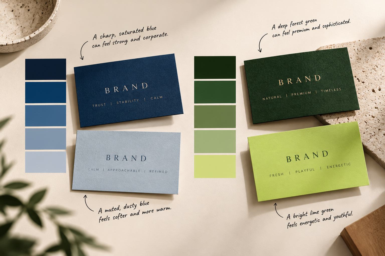
Researchers Lauren Labrecque and George Milne, writing in the Journal of the Academy of Marketing Science, examined how individual hues connect to specific brand personality traits and found that saturation and brightness can further strengthen or soften those traits. A muted, dusty blue reads differently from a sharp, saturated one. A deep forest green doesn’t communicate the same thing as a bright lime green, even though both are “green” on a colour wheel.
That’s the detail most colour guides leave out. They’ll tell you blue means trust and red means energy, as if colour worked like a dictionary. In practice, it works more like tone of voice: the same word can sound warm or clipped depending on how it’s said, and the same hue can read as premium or playful depending on how it’s used.
Why “Red Means Passion” Is Only Half the Story
Three things shape what a colour actually communicates, and none of them is the colour itself.
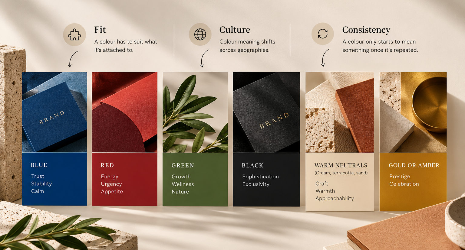
Fit. A colour has to suit what it’s attached to. Research by Bottomley and Doyle found that colour appropriateness, whether a hue feels right for the product – matters alongside the colour’s inherent associations. A soft sage might feel exactly right for a skincare label and slightly odd on a construction firm’s van.
Culture. Colour meaning shifts across geographies in ways that are easy to overlook when you’re designing from within one market. Research by Madden, Hewett, and Roth on cross-national colour meaning found real differences in how colours are perceived across countries. This is a reminder worth considering for any brand building an identity that travels, or one operating in a market as layered as India, where a single colour can carry entirely different weight depending on the occasion in which it appears.
Consistency. A colour only starts to mean something once it has been repeated. The first time someone sees a brand’s colour, it’s just a colour. By the tenth time, it’s a signal. This is less about picking the “right” hue and more about picking one and sticking with it.
A Rough Guide – Held Loosely
Colour |
Tends to signal |
Where it breaks down |
| Blue | Trust, stability, calm | Can read as cold or corporate without warmth elsewhere in the identity |
| Red | Energy, urgency, appetite | Overused in categories where it now reads as generic rather than bold |
| Green | Growth, wellness, nature | Loses meaning fast if the brand has no real connection to sustainability |
| Black | Sophistication, exclusivity | Can tip into severity without softer material or type choices to balance it |
| Warm neutrals (cream, terracotta, sand) | Craft, warmth, approachability | Can tip into severity without softer materials or type choices to balance it |
| Gold or amber | Prestige, celebration | Cheapens quickly at the wrong saturation or paired with the wrong texture |
Treat this as a starting instinct. The right question is never, “What does this colour mean in general?” It’s “What does this colour mean here, for this brand, for this brand, next to these other choices?”
How We Think About Palette at Empower Branding
When we build a brand identity, colour is rarely the first decision. It’s usually one of the last, because it needs a context to belong to. We start with how the brand is meant to feel: precise and fast, unhurried and warm, or quietly premium. The palette is chosen to express that feeling, not the other way around.
It’s also never chosen in isolation. A colour behaves differently alongside a serif than a sans-serif, on matte packaging than on a glossy screen, and at 100% opacity than at 20%. Two brands could use the exact same hex code and end up with identities that look nothing alike, because everything around the colour is different.
Consistency Is What Turns Colour Into Memory
None of this works as a one-time decision. Colour builds recognition through repetition. A colour only becomes “yours” once an audience has seen it often enough, across enough touchpoints, to stop registering it as a colour and start associating it with your brand.
This is also where many well-designed identities lose their edge. It happens not at the palette stage, but afterwards, when new trends pull at colour choices that were never meant to change. A palette isn’t a seasonal decision. It’s closer to a signature – worth revisiting occasionally, but not reinventing every time something new catches the eye.
Where Colour Meets the Screen and the Shelf
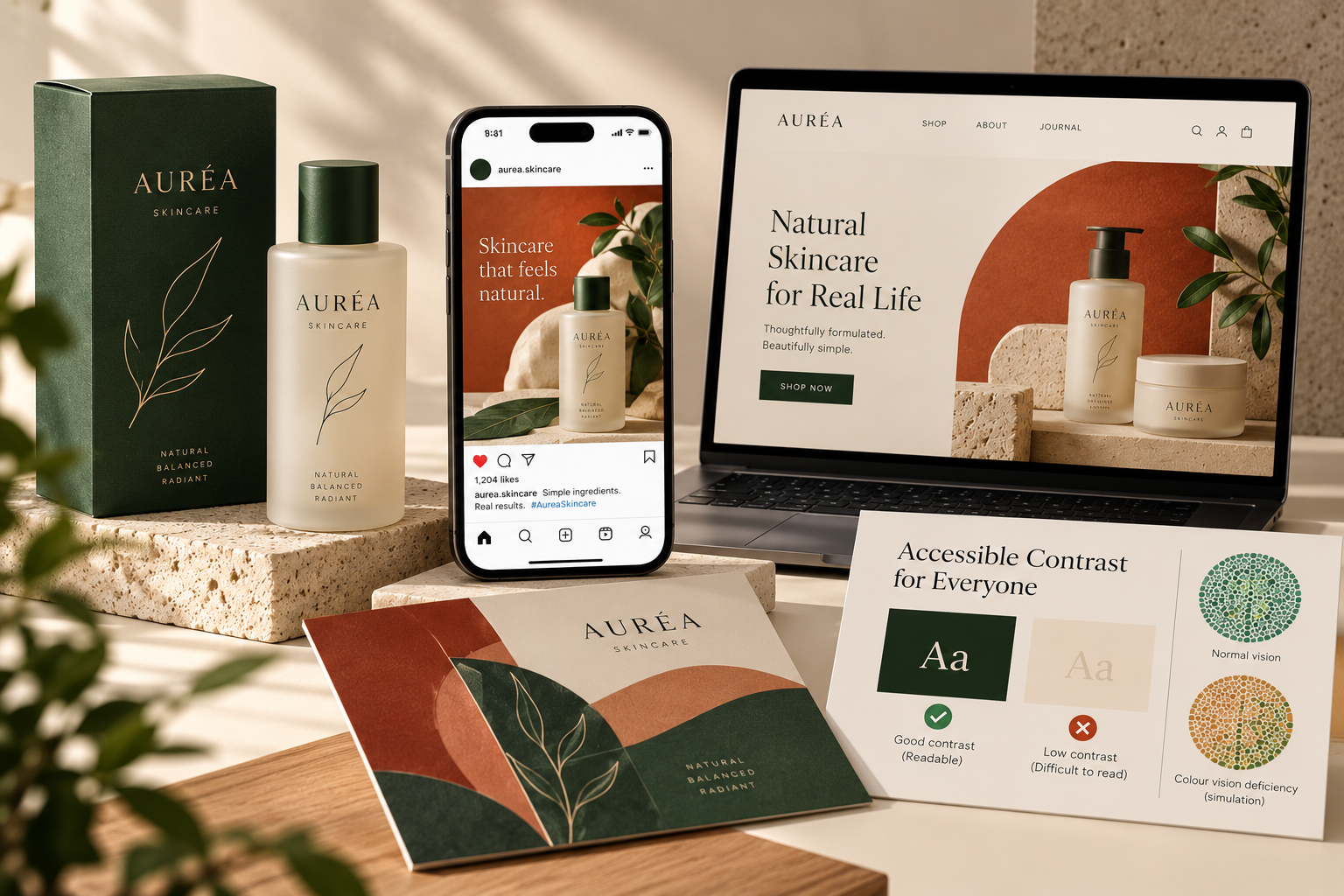
Colour also has to survive translation. What looks beautiful on a moodboard has to hold up on a phone screen in direct sunlight, on a printed box under warehouse lighting, and for the roughly 1 in 12 men (and a much smaller proportion of women) who experience some form of colour vision deficiency and may not perceive contrast in the same way as most viewers.
Accessible contrast – meaning enough difference between text and background to keep it legible for everyone – isn’t a constraint on good colour design. It’s part of it.
How people find brands has shifted, too: through a feed, a search result, or a recommendation from an AI assistant. A palette now has to maintain its identity across more surfaces than it used to, from a physical package on a shelf to a thumbnail just three inches wide.
One Thought to Leave With
Colour doesn’t build a brand on its own. But it’s often the first thing a brand communicates and one of the last things a customer remembers. Choosing it with intention – considering what it sits beside, who it speaks to, and how consistently you use it – can make a significant difference.
If your palette feels more like a habit than a conscious decision, it might be time to rethink it.
Frequently Asked Questions
What is colour psychology in branding?
It’s the study of how colour shapes what people feel, notice, and remember about a brand. Meaning isn’t fixed, it depends on the product category, the culture it’s shown in, and how consistently the colour is used over time.
Does colour really affect buying decisions?
Studies link colour to perceptions of trust, energy, and quality, and to purchase intent in experimental settings, but colour alone rarely decides a sale. It shapes the first impression a product or brand gets to work with.
How many colours should a brand palette have?
There’s no fixed number, but two to three primary colours plus a set of supporting neutrals is a common, workable structure. It gives enough range for different formats, without diluting recognition.
Is there a single best colour for a brand?
No. The right colour is the one that fits the category, suits the audience, and can be repeated consistently, not the colour with the most flattering psychology behind it.
Does colour mean the same thing in every country?
Not reliably. Colour associations shift across cultures, which matters for any brand building an identity meant to travel beyond one market.